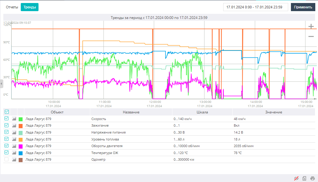
Viewing data as a chart
The Charts tab is intended for visual analysis of sensor values over a selected time interval. You can simultaneously see the values of several sensors from different objects. By default, the entire selected time interval is visible, but the time interval visible on screen can be reduced by clicking the minus icon in the upper right corner of the Charts tab or by scrolling the mouse wheel.
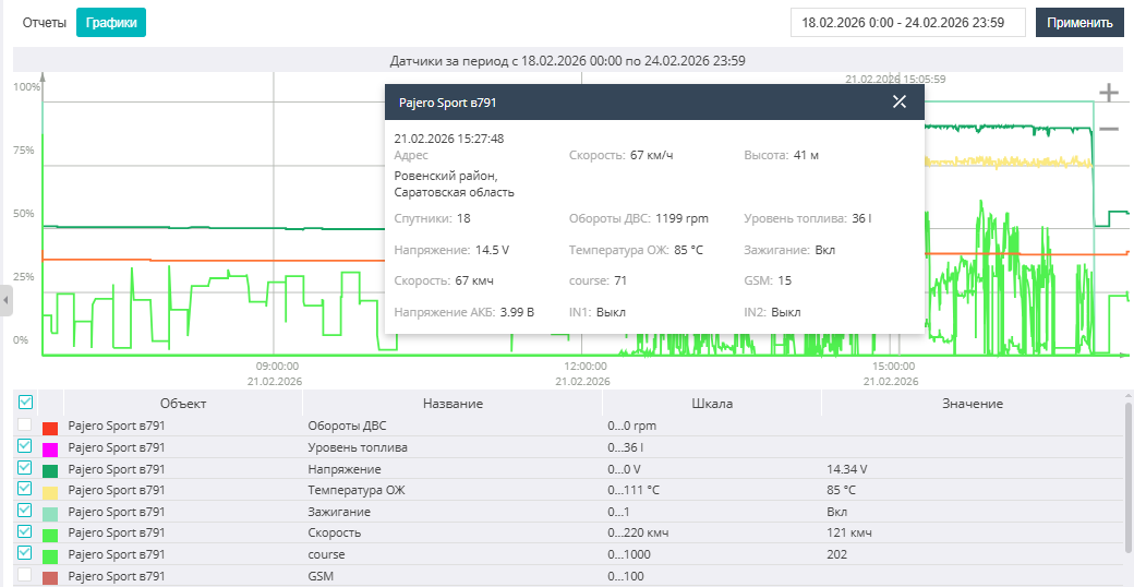
Below the chart area there is a list of sensor charts indicating the object they belong to, the sensor parameter scales, and the value at the cross-section. Checkboxes allow you to control the visibility of a sensor's chart.
In the chart area, pictograms of drains and refuelings recorded for an object are shown, indicating the value in liters of the drain or refueling.
The tabular information from the Charts tab can be exported to an MS Excel file, printed on a printer, or saved as a PDF file by clicking the printer icon in the lower right corner of the page. The charts can be printed on a printer or saved as a PDF file.
If you need to see sensor values at a specific moment in time, click the left mouse button on the chart line of any sensor. The values of the object's main parameters, as well as of the configured sensors, will be displayed in a pop-up window linked to the object's location and the time and date of the current data.